Section Styles sticky
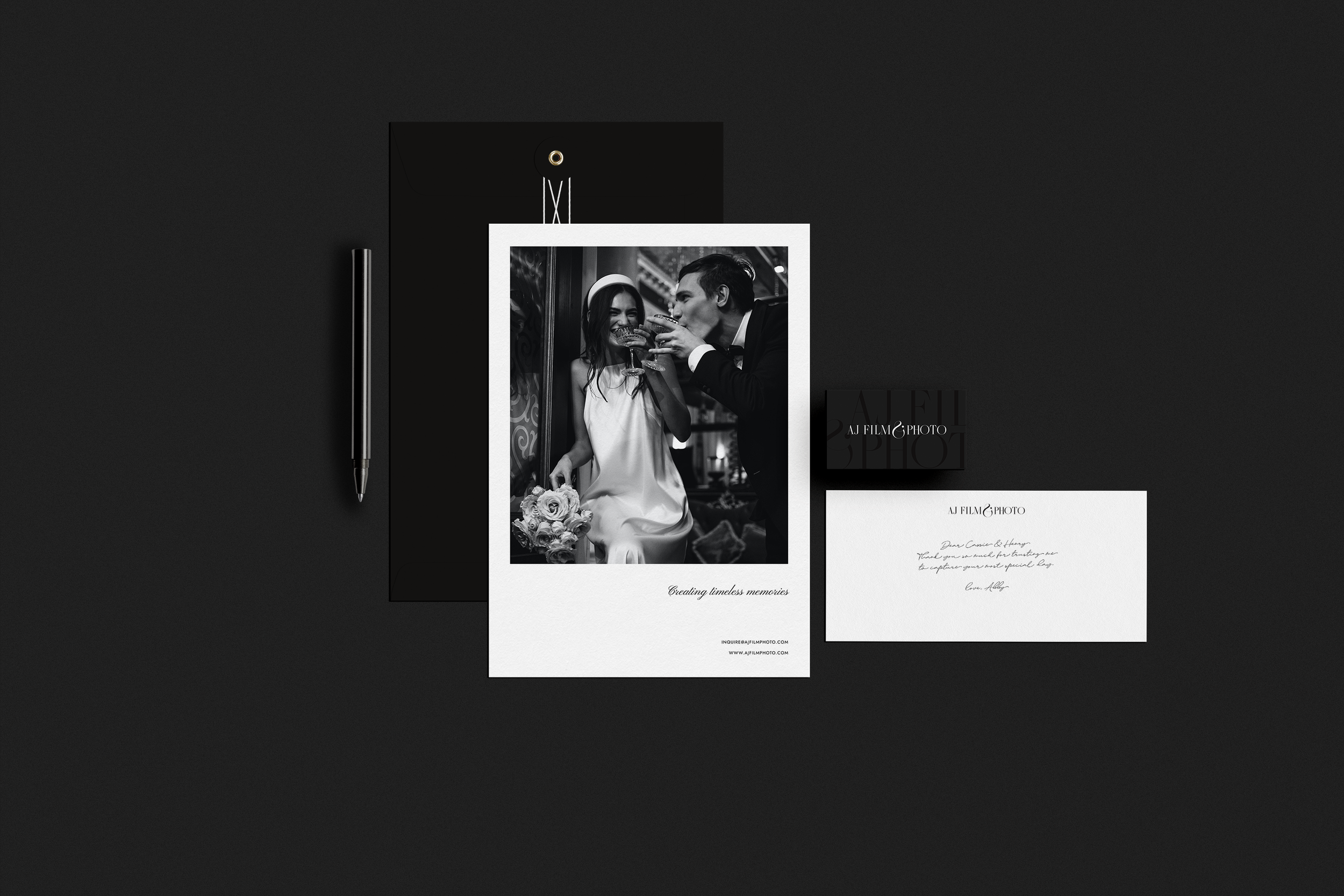
In the realm of wedding photography and videography, Abby aspired to have her brand become an embodiment of the timeless, the classy, and the modern – the very essence that defines her impeccable work. We undertook the challenge of translating this vision into her brand identity, with a focus on crafting a visual narrative that captures the essence of her artistry.
To conjure the timeless style that Abby yearned for, we selected a contrasted serif font. It is graceful yet commanding presence lends an air of sophistication and enduring elegance to her brand, just as her wedding photography and videography do to the moments they immortalize.
In our design journey, the unique ampersand emerged as a symbol of unity and connection, subtly weaving the threads of love, a common thread throughout weddings, into the visual identity. Its distinctive shape, resonant with the individuality of each couple, serves as a testament to Abby's artistry in capturing unique stories within her craft.
The classic color palette of black and white, an embodiment of timeless elegance, became the cornerstone of the visual identity. Black signifies depth, formality, and sophistication, while white exudes purity and simplicity. Together, they harmoniously coalesce to create an aura of grace, much like the emotions Abby adeptly captures in her work.
In every aspect, from typography to color, Abby's brand exudes a timeless, classy, and modern charm that harmoniously aligns with the very spirit of her wedding photo and video artistry.


