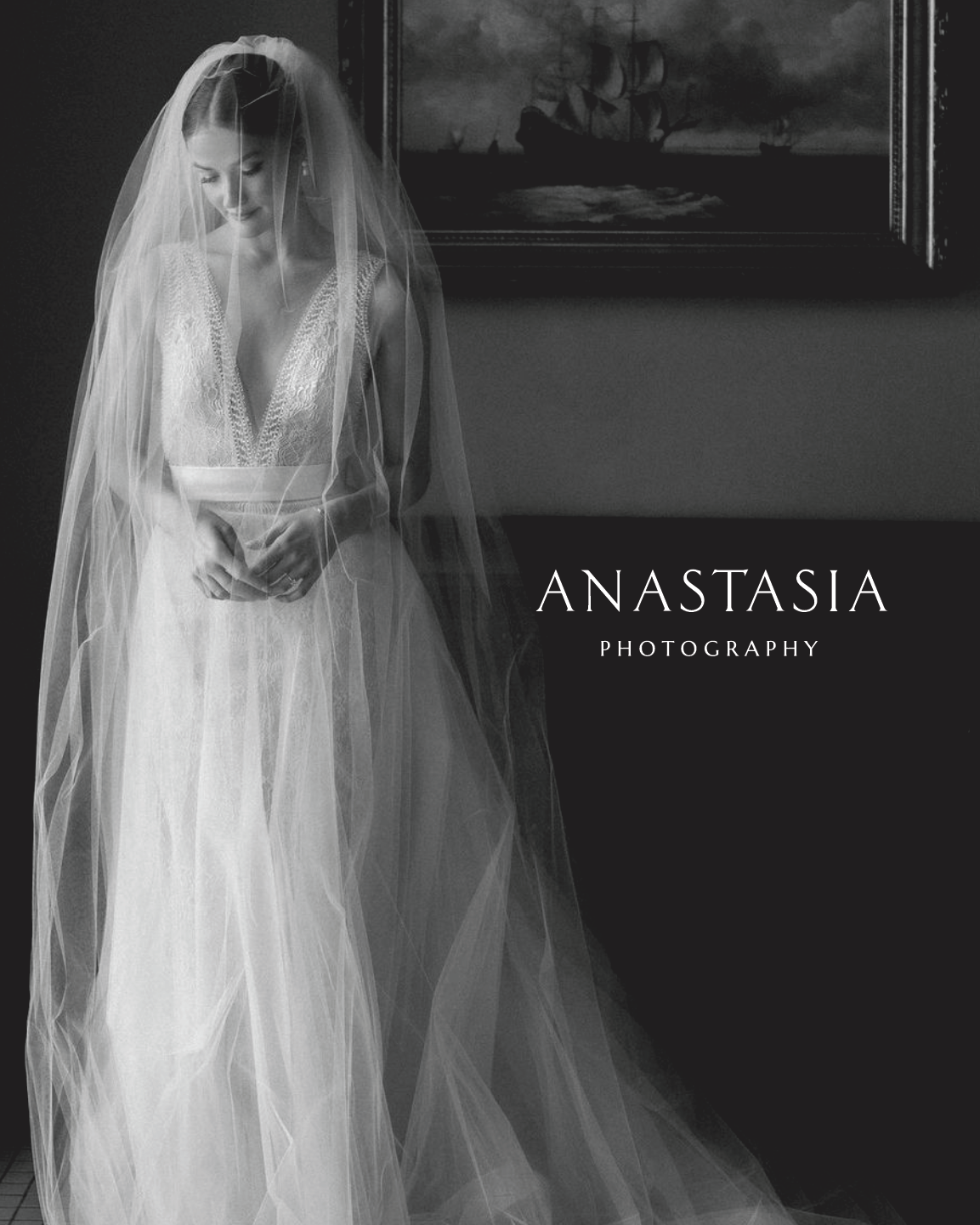
Anastasia Photography
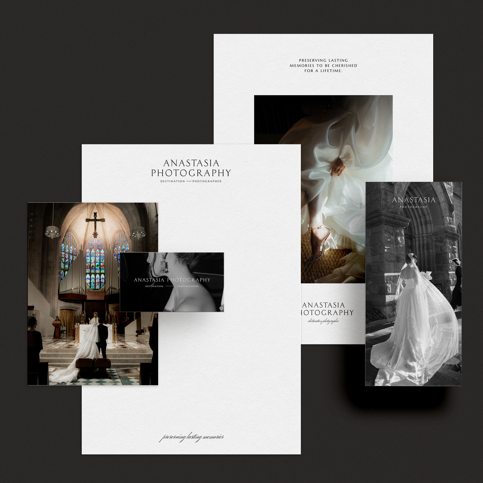
Anastasia, with a keen eye for timeless elegance fused with modern chic, envisioned branding that would seamlessly capture the essence of her unique style. To bring this vision to life, we carefully curated a design strategy that exudes sophistication and simplicity.
In crafting her logo and overall branding, we opted for a classic serif typeface. The choice of this timeless font serves as a nod to tradition while embodying the enduring quality of Anastasia's aesthetic. Its clean lines and graceful curves contribute to a visual identity that stands the test of time.
The color palette we selected further enhances the refined atmosphere of her brand. Striking a balance between classic and contemporary, we incorporated neutral tones such as black, white, and beige. These colors not only convey a sense of timelessness but also provide a versatile canvas for future expressions of her brand.
By marrying a traditional serif typeface with a sophisticated color scheme, we've created a brand identity that mirrors Anastasia's desired fusion of enduring style and contemporary allure. This cohesive approach ensures that her brand remains not only visually appealing but also consistently aligned with her overarching aesthetic vision.