W Haus of Design
W Haus of Design is an upscale interior design studio, offering a sanctuary where artistic vision transforms living spaces into veritable works of art. At the heart of this creative endeavor is Emily, the visionary behind the brand, who sought to fashion a visual identity that would not only resonate with the luxury and refinement inherent in her interior design studio but also exude a sense of timeless elegance.
In our journey to capture the essence of Emily's design philosophy, we wanted elements that would mirror the classic and timeless allure that defines W Haus of Design. In our typography choice, we selected a classic serif typeface, a resolute nod to the enduring traditions of design that have stood the test of time.
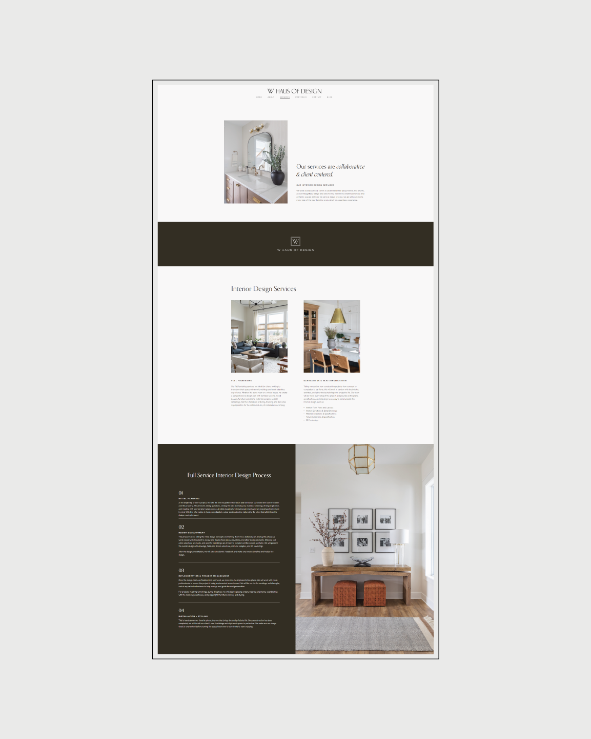
The fusion of classic serif typeface with the neutral color palette presents a visual narrative that whispers luxury and timelessness. It speaks to the ability of W Haus of Design to transform any space into a timeless masterpiece, a testament to Emily's unwavering commitment to creating interiors that transcend fleeting trends and stand as a testament to enduring beauty. In this way, the brand identity seamlessly aligns with the very essence of W Haus of Design and Emily's vision.