Reframing a B2B Product for the At-Home Parent Experience
Splocks started as a product line sold exclusively to trampoline parks and play centers. Taking it D2C meant designing for a completely different buyer and discovering that the existing platform, brand, and messaging created friction at every step of the parent journey.
01 - the core problem
Two completely different
buyers. One platform.
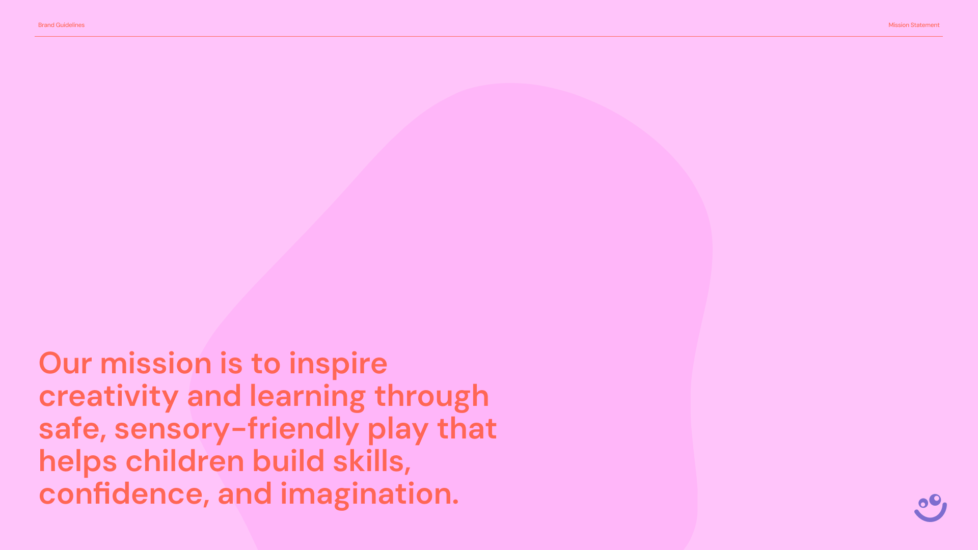
The core issue is not just “selling online.” Parents do not interpret foam blocks the same way as B2B buyers do.
The problem was that everything built for the B2B buyer actively worked against the D2C parent. The platform, the messaging, the photography, the pricing structure — all of it was optimized for a procurement buyer, not a mom browsing Instagram at 9pm deciding whether to spend $80 on foam blocks for her living room.
"Is this safe for my child? Will they actually use it? Where does it even go in my house?"
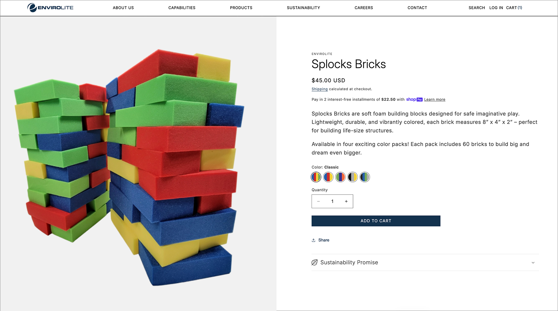
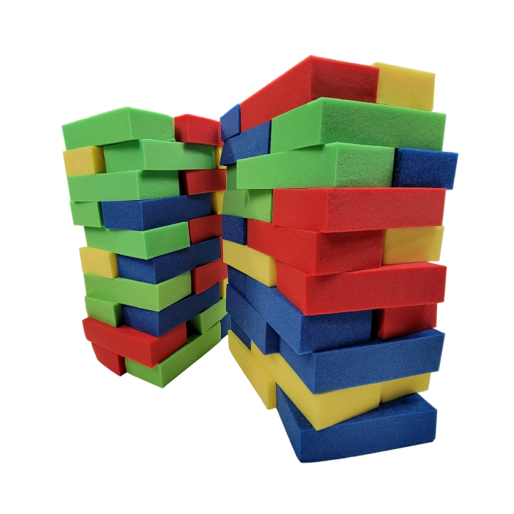
Previous Product Page
The Envirolite B2B product page felt clinical and corporate, lacking the playfulness and excitement that reflects the product experience. It also provided limited product information and few lifestyle images, making it difficult to understand scale and real-world usage.
02 — Friction Audit
Where the B2B experience
broke for parents
Before designing anything, I mapped what a parent actually experienced trying to evaluate and buy foam blocks from the existing Envirolite presence. The friction was not subtle and it started the moment they landed on the page.
The five biggest friction points
03 - The Challenge
Building a brand from nothing
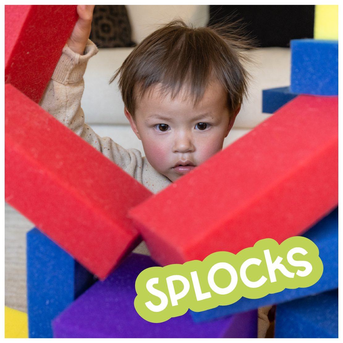
Splocks Bricks, the vibrant and foam building blocks designed for children's enjoyment, inspired our dynamic rebranding journey. Our goal was to encapsulate the essence of fun and playfulness inherent in these colorful blocks.
The Starting Point
When I joined the project, Splocks had one product, small foam building bricks, sold exclusively on Amazon under the parent brand Envirolite. There was no standalone brand, no website, and only low-quality product photography.

photos Before
Photos felt clinical and sterile
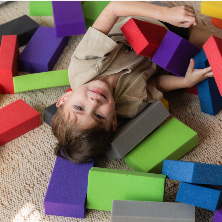
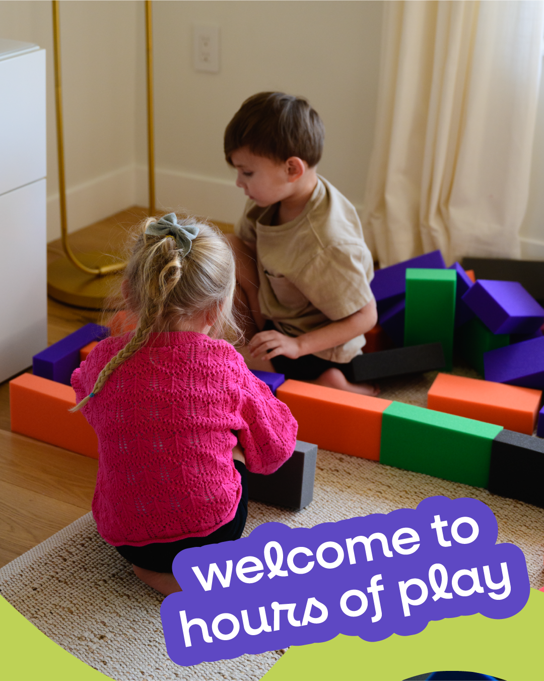
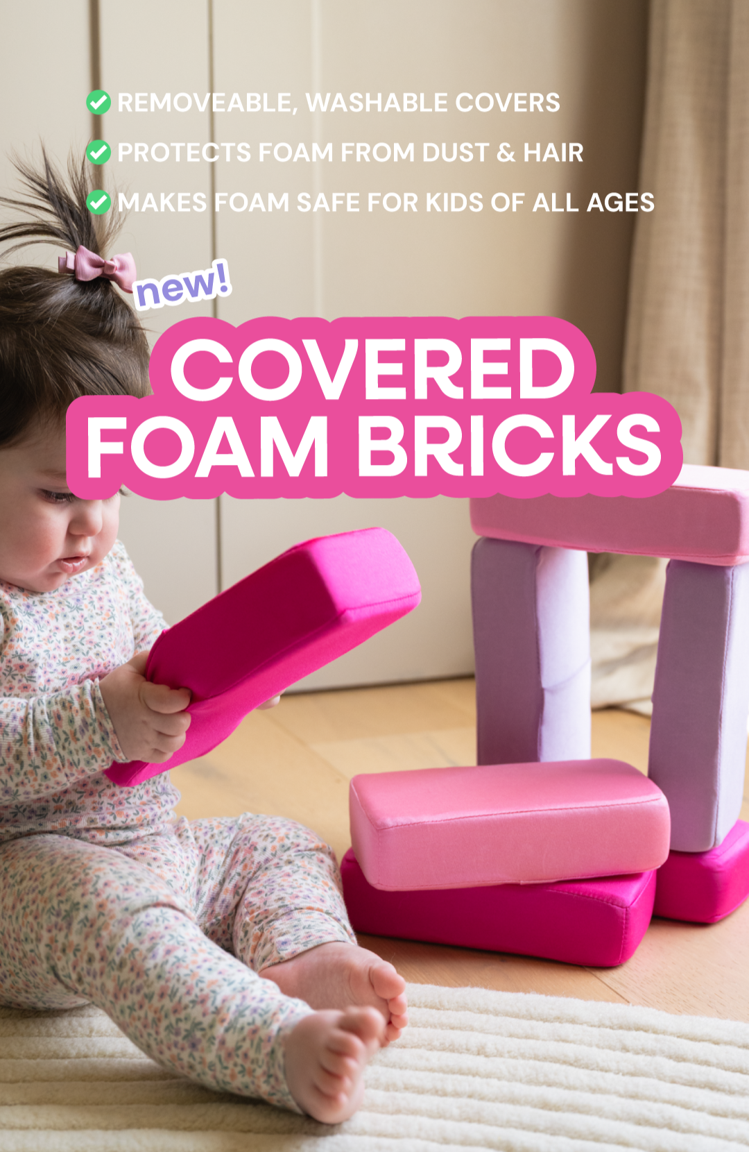
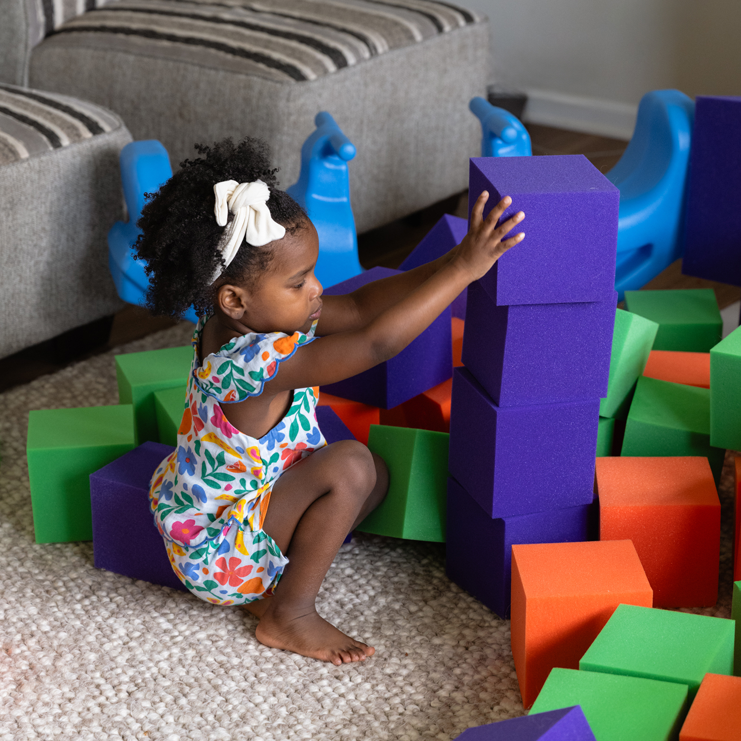
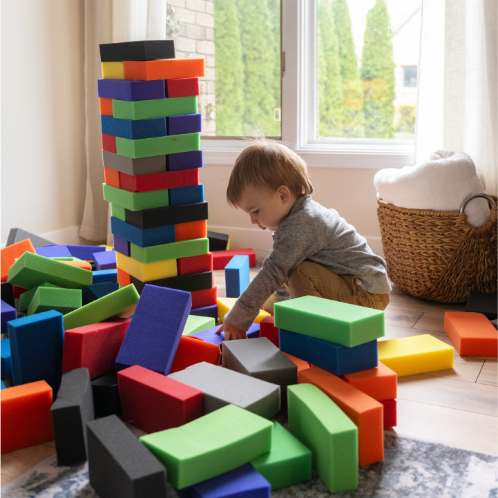
photos After
Photos feel inviting and approachable
The business goal was clear: build a brand identity and launch a D2C Shopify storefront from scratch within three months.
04 — Brand Identity
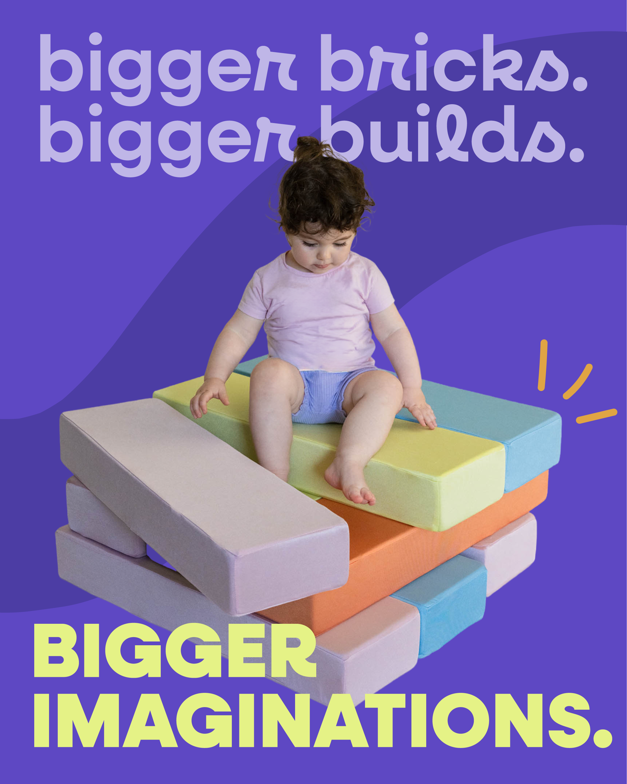
A visual language as playful as the product
The brand system was built to feel immediately recognizable warm, energetic, and a step above the usual child’s brand aesthetic.
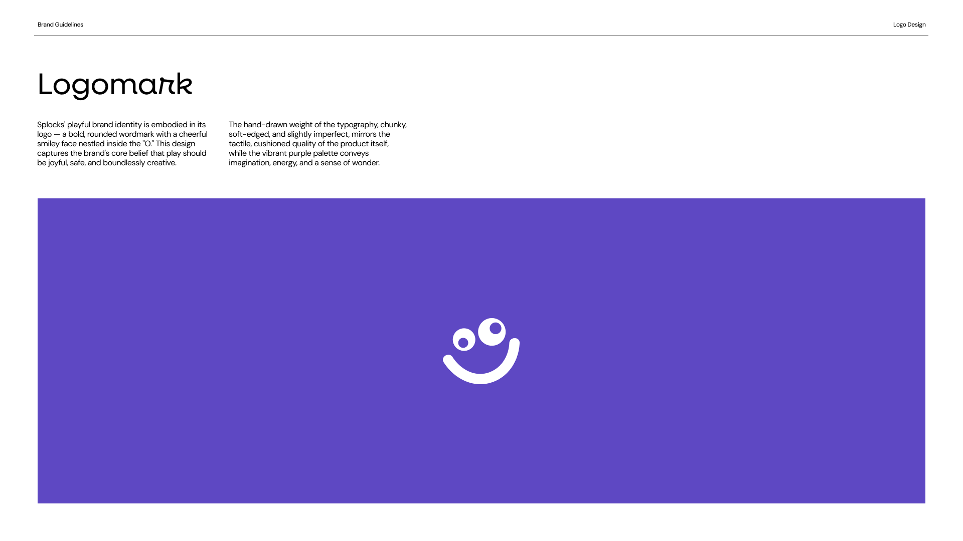
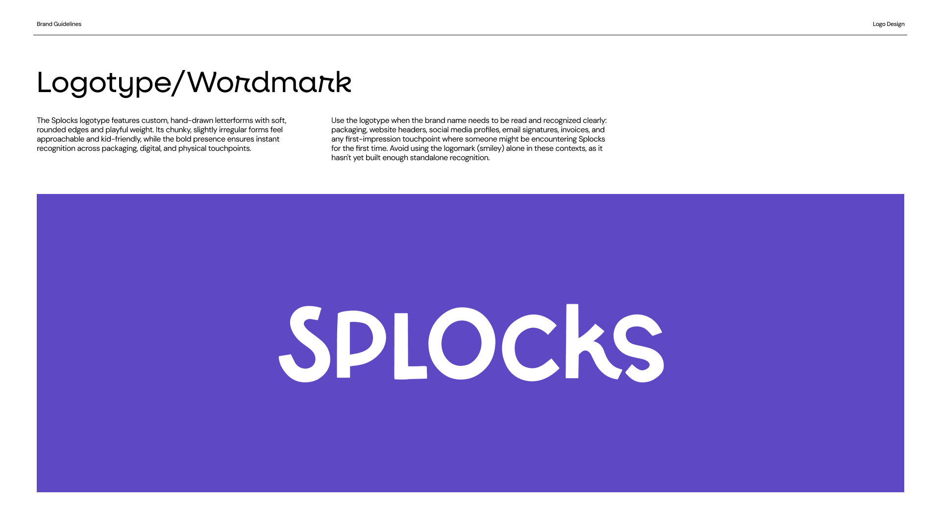
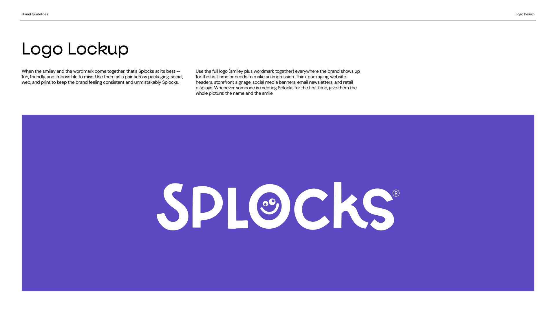
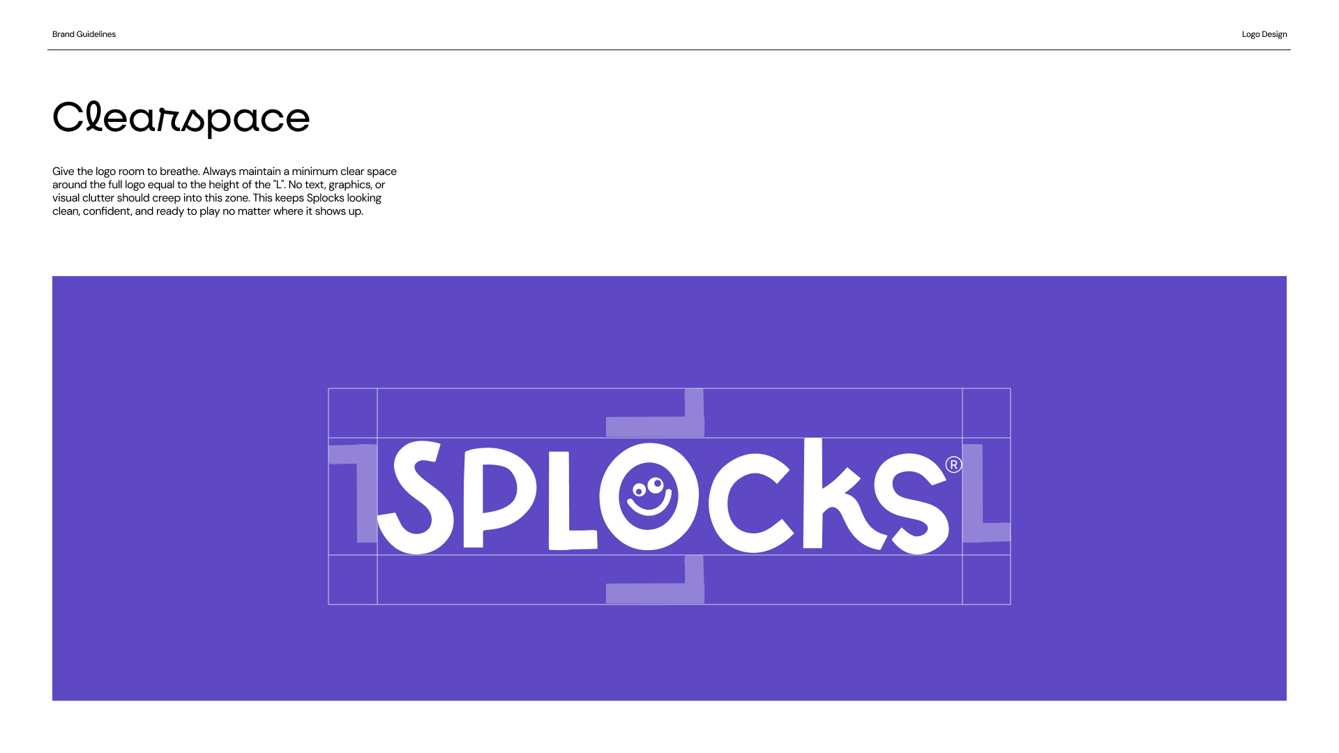
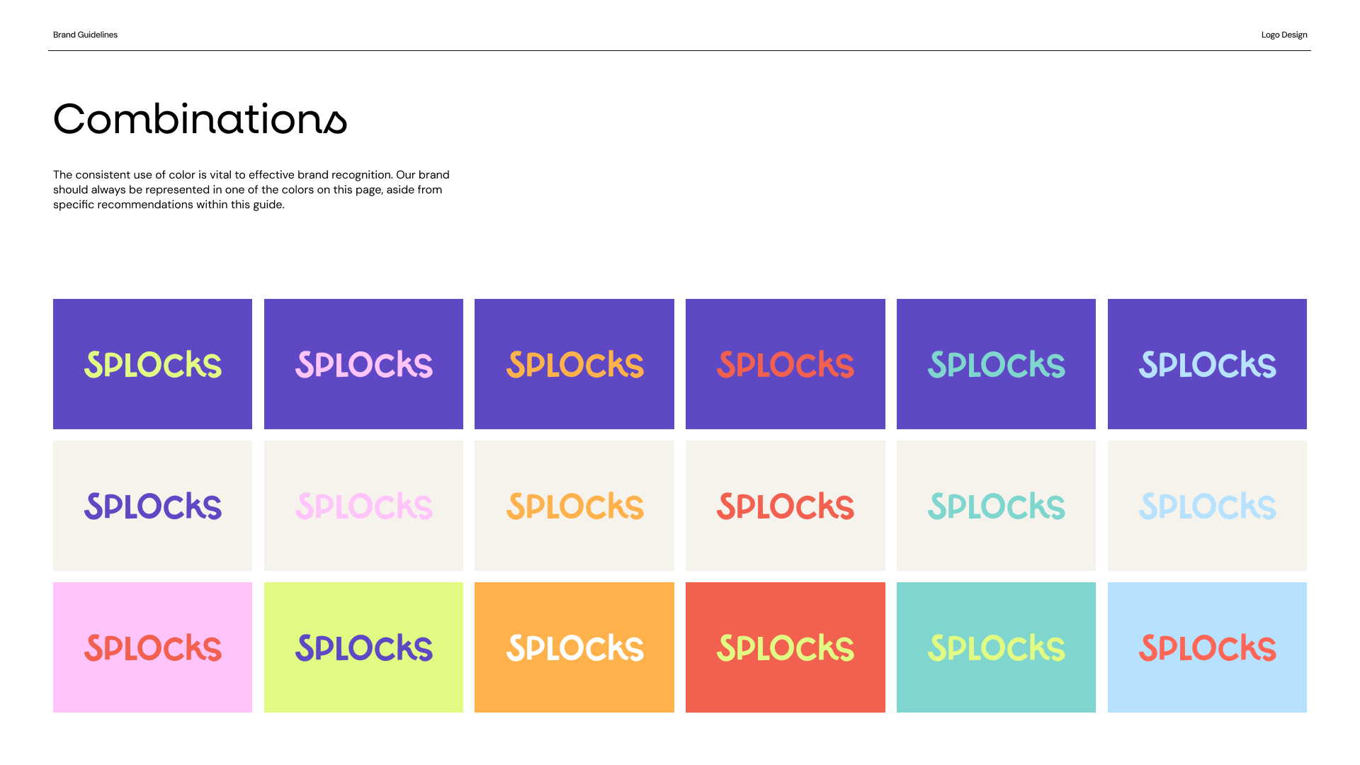
For the logo, I chose a custom wordmark that deliberately steps away from the brand typeface. Keeping the two separate gives the wordmark its own identity and ensures it reads as a standalone mark rather than a headline, something simple enough to be reproduced consistently across packaging, social, labels, and any future product touchpoints.
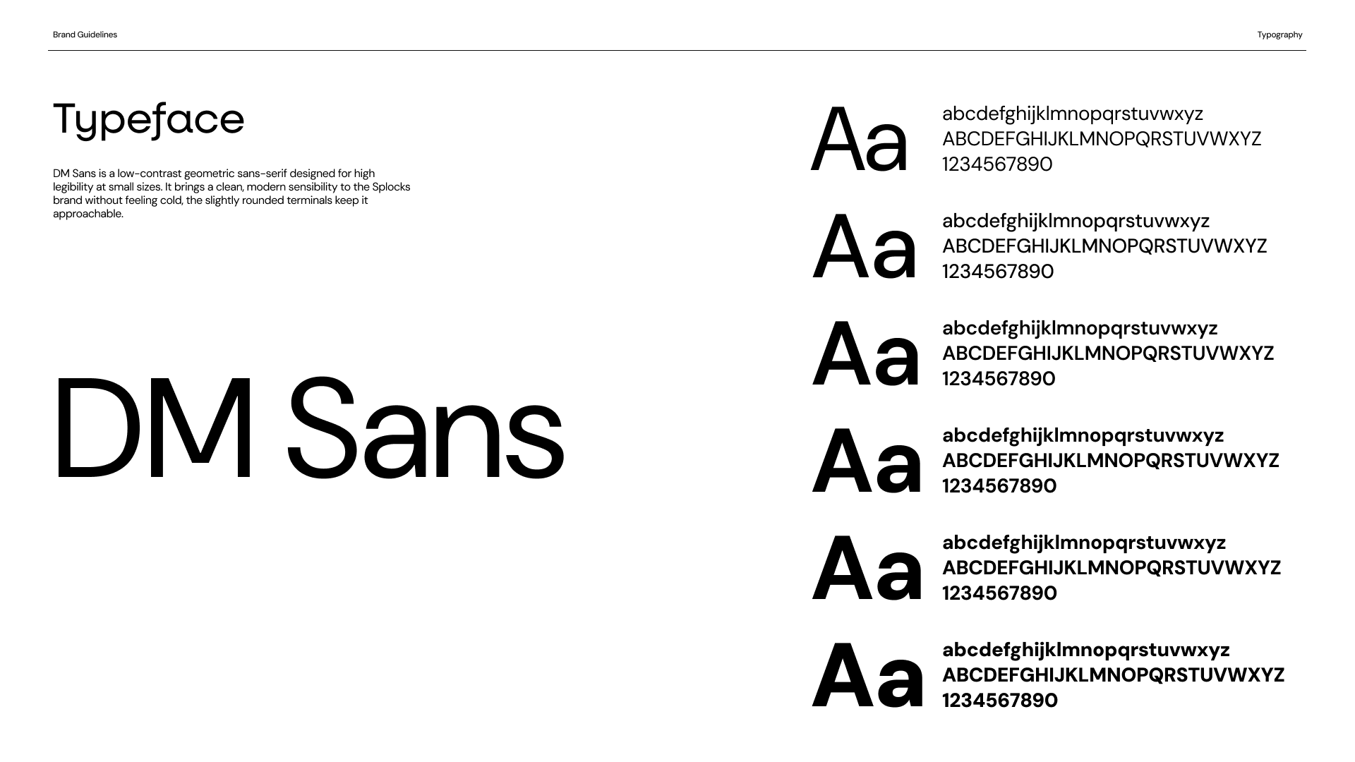
The primary typeface is DM Sans, chosen for its versatility and extensive weight family. Having a range of weights available, from light to bold, meant the type system could do a lot of work across very different contexts: small captions on packaging, bold CTAs on the website, and everything in between, all from a single cohesive family.
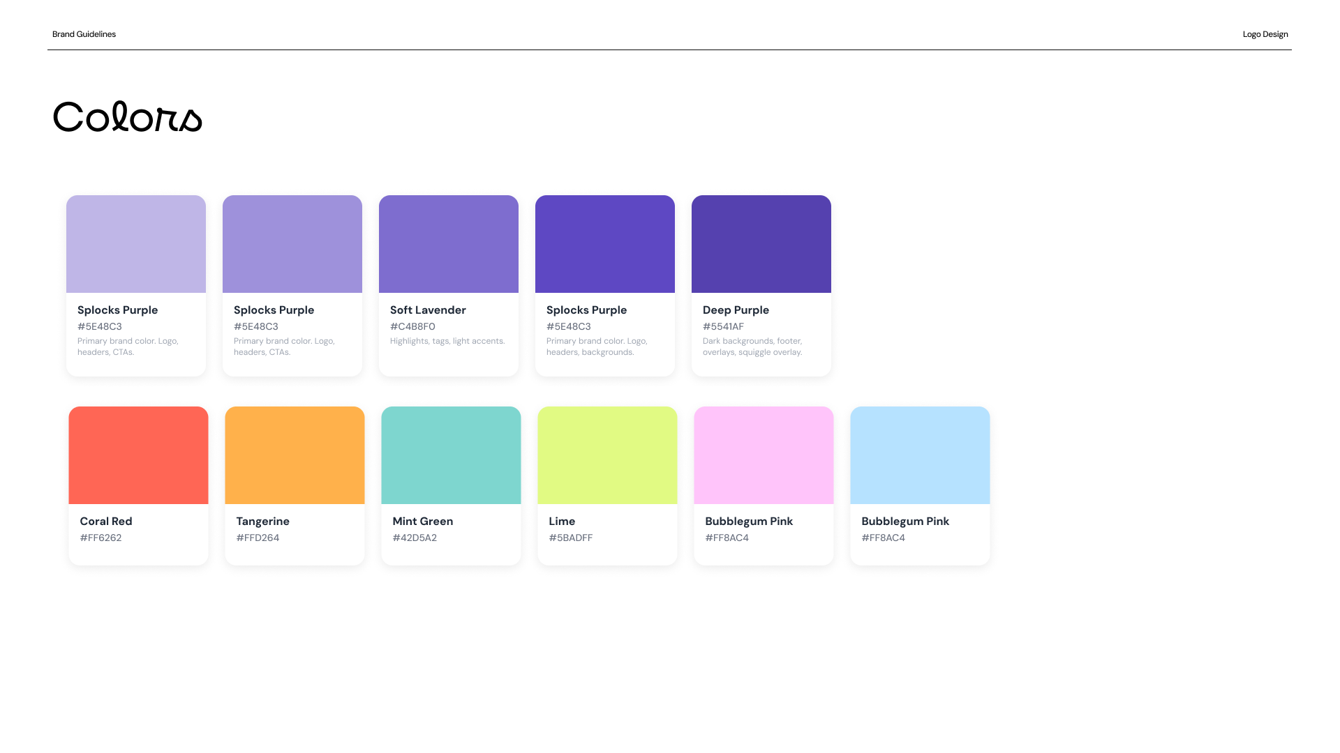
The color palette anchors the brand in purple, gender-neutral, differentiated from the parent brand's blue, and a natural fit for a product that already ships in a full spectrum of colors. Lime, teal, blue, pink, red and orange round out the palette as accent colors, adjacent and complementary to purple, giving the system the energy and playfulness the product calls for without tipping into chaos.
I introduced playful organic shapes and squiggles to evoke a more engaging and child-friendly sense of play.

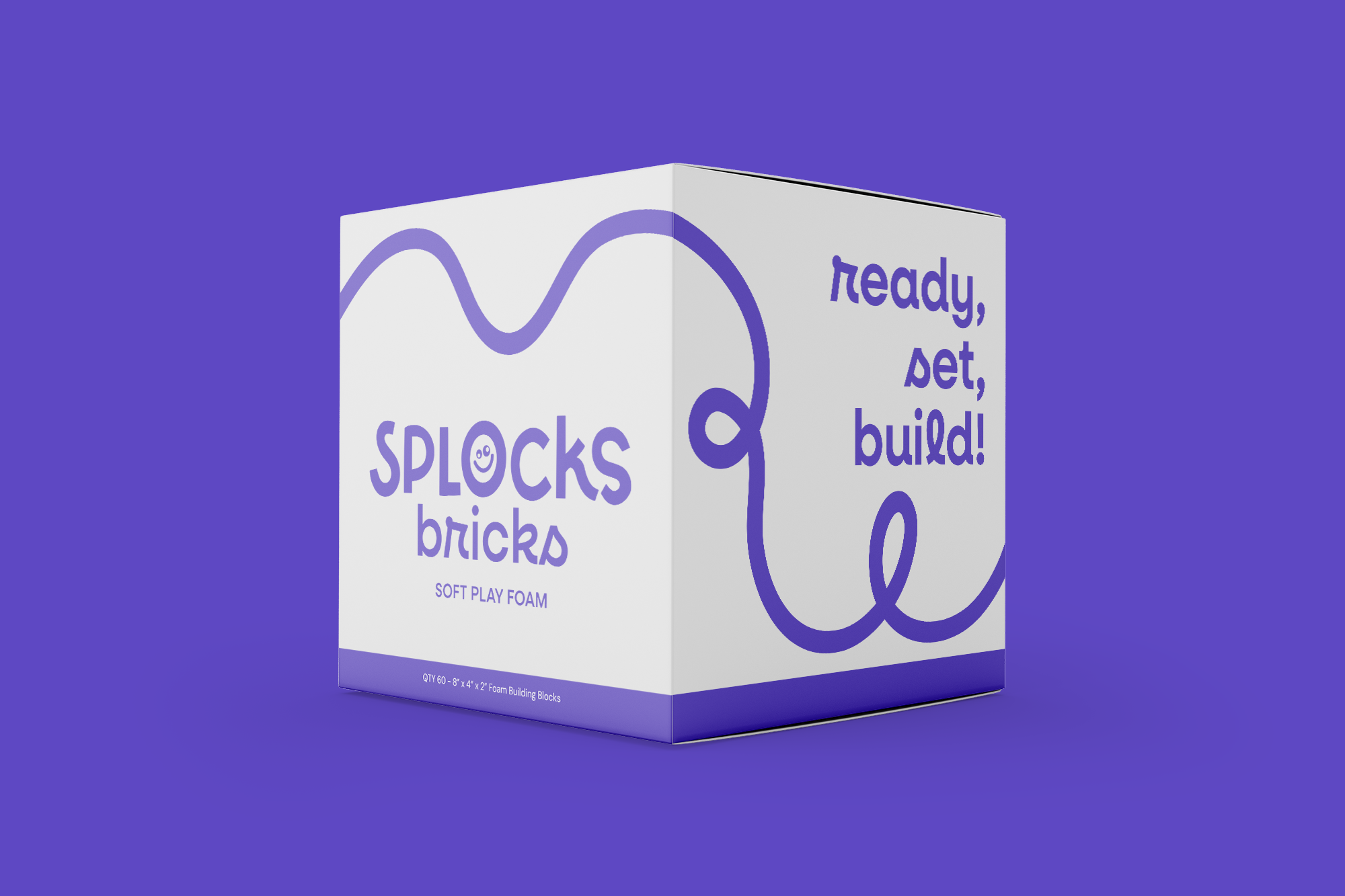
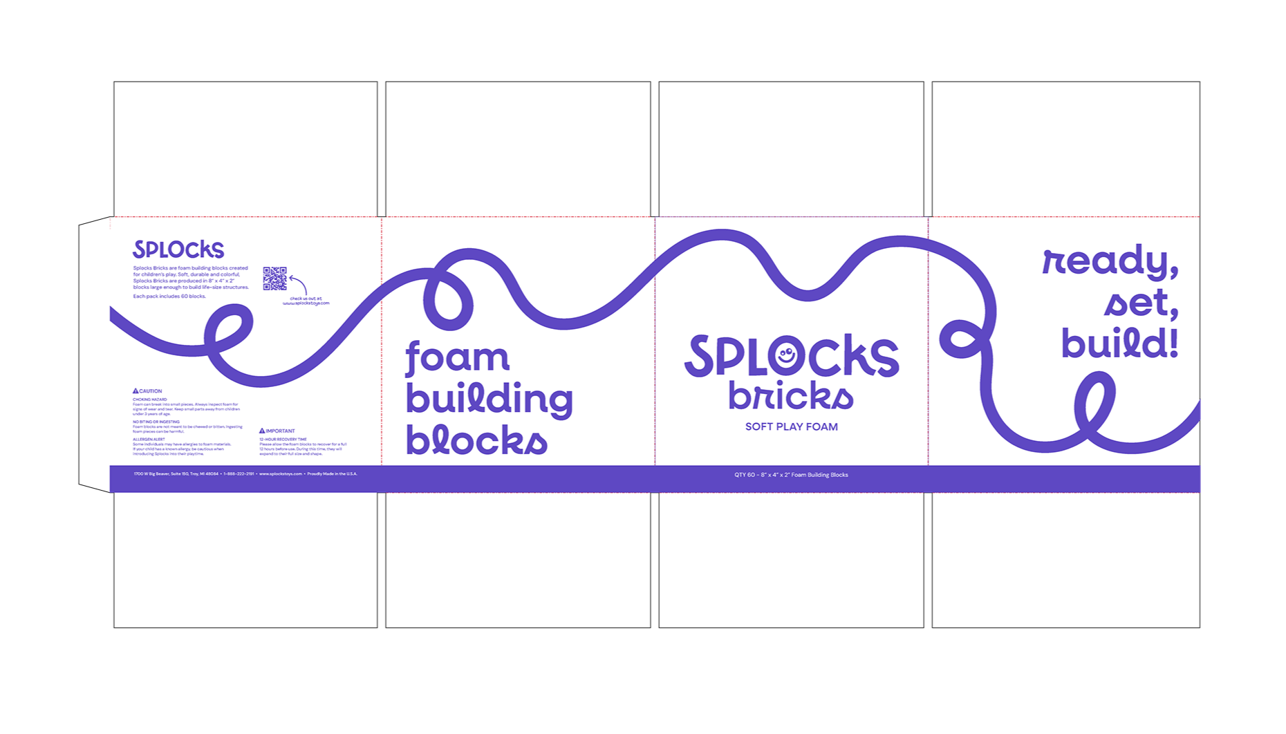
05 — Packaging Design
Fun at scale, on a tight budget
Full-color printing was outside the budget, so the packaging had to work in a single color. Rather than letting that be a limitation, I leaned into it as a design challenge, using the brand's primary color, typography and illustration to carry the full weight of the visual identity.
The centerpiece of the design is a whimsical hand-drawn line illustration that wraps continuously around the box. This was a deliberate choice to make the packaging feel dimensional and premium despite the single-color restriction. I paired this with expressive display type.
Typography did a lot of the heavy lifting here. With no color variation to create hierarchy, the type scale and weight contrast had to clearly guide the eye from brand name to product name to call to action without noise.
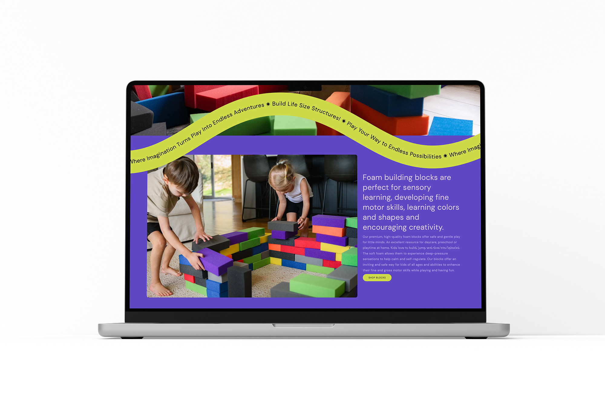
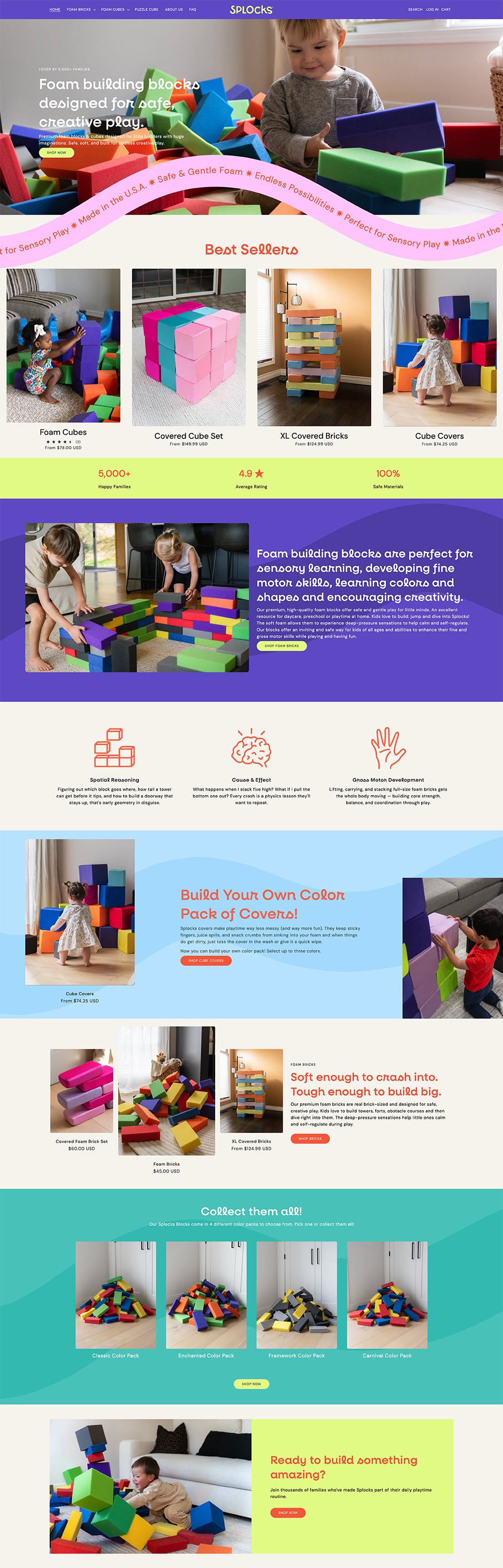
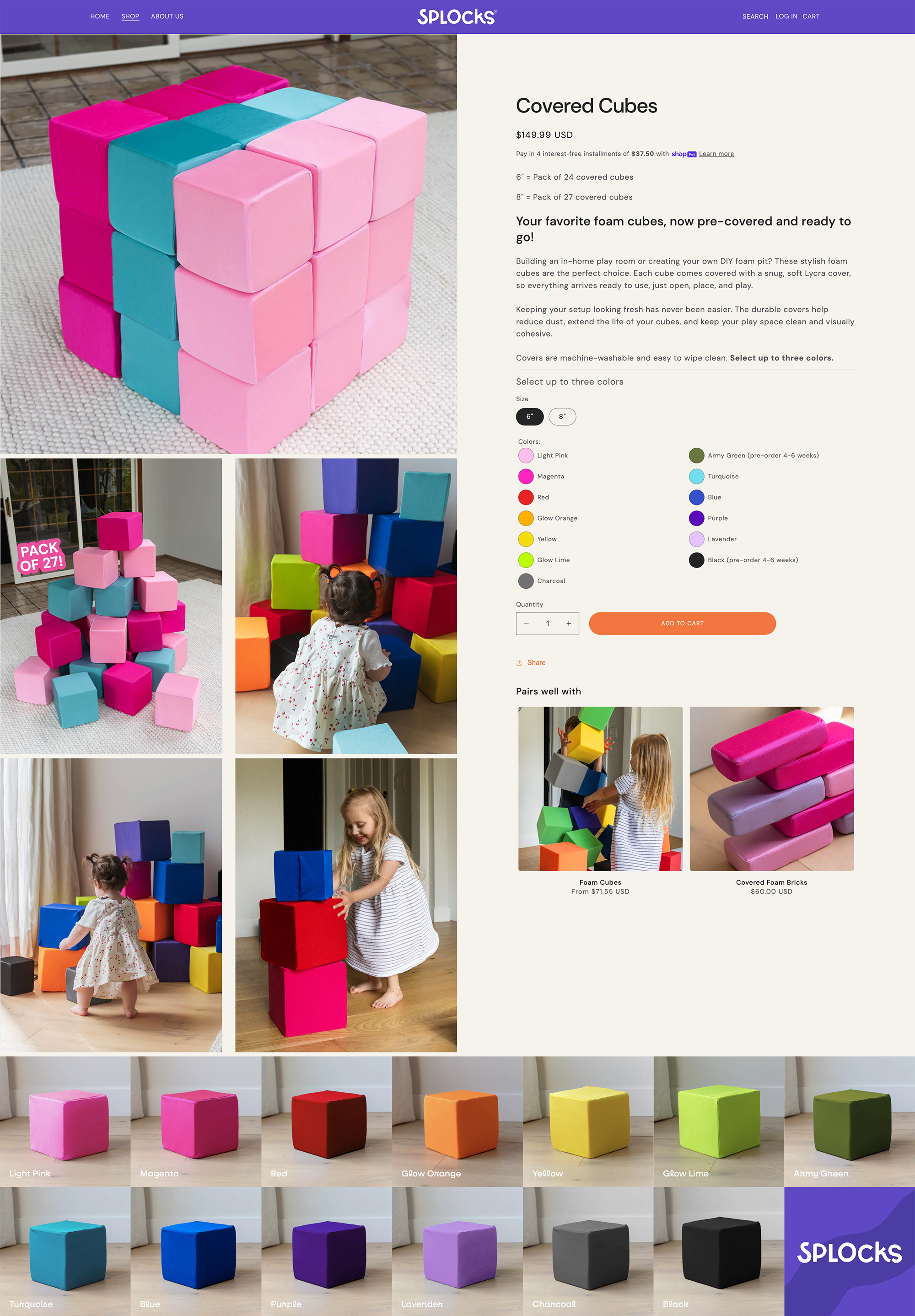
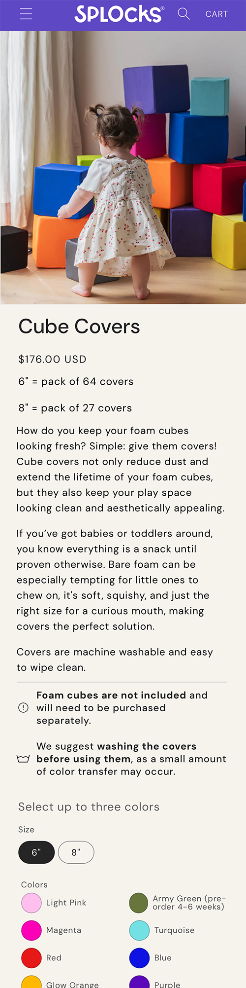
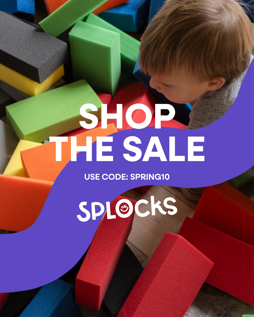
06 — Shopify Store Design & Development
A conversion-focused e-commerce experience
Custom theme, full control
Started from a custom Shopify theme rather than an off-the-shelf template, giving full control over layout and brand expression from day one.
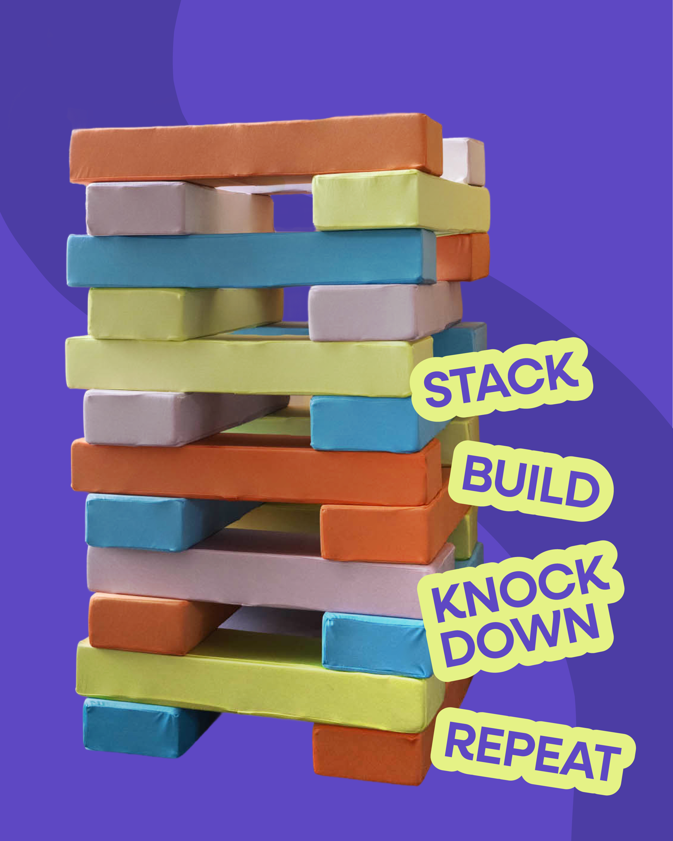
Action-first homepage
Shop Now CTAs appear early and often, capturing both the casual browser who needs a nudge and the ready buyer who knows what they want.
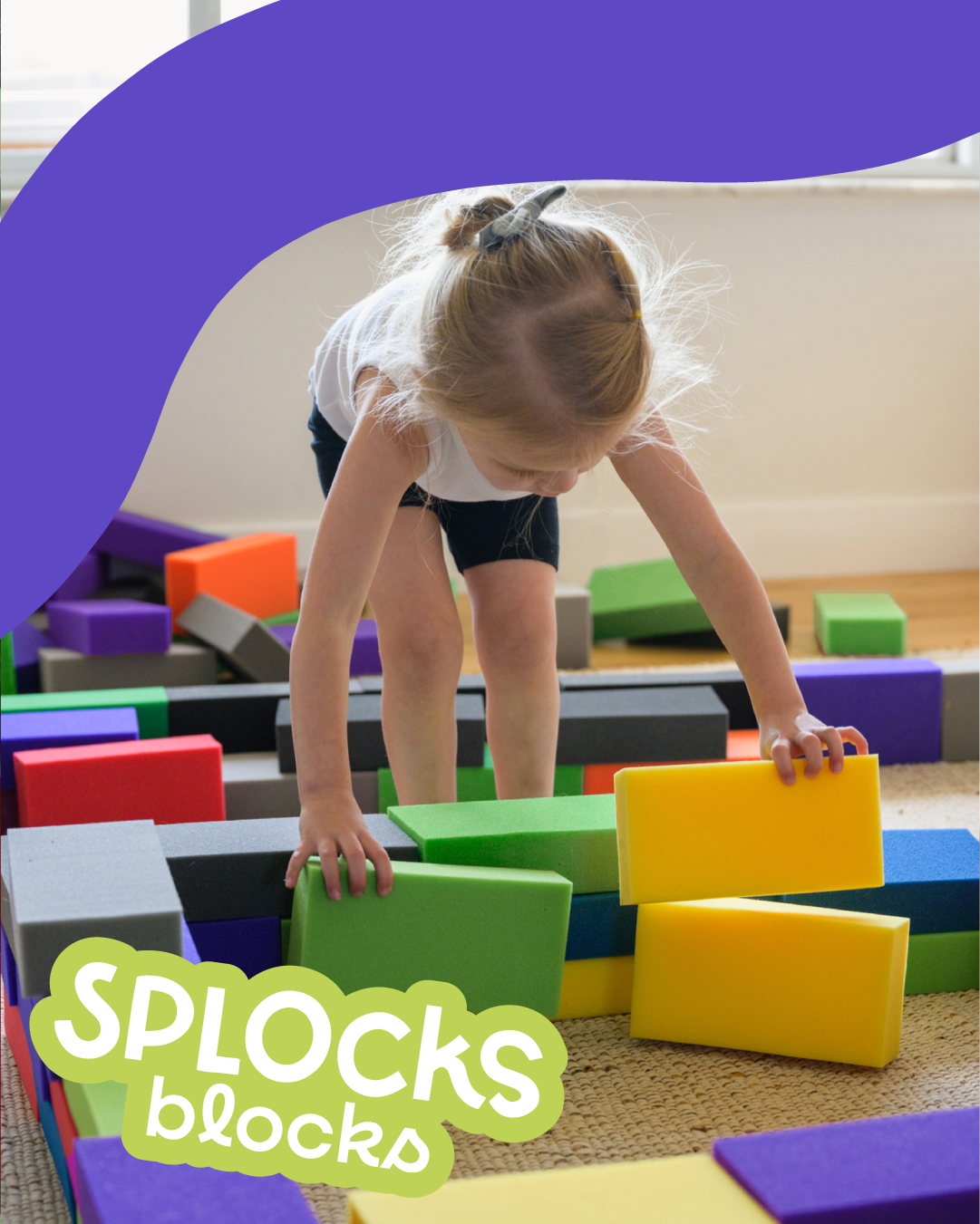
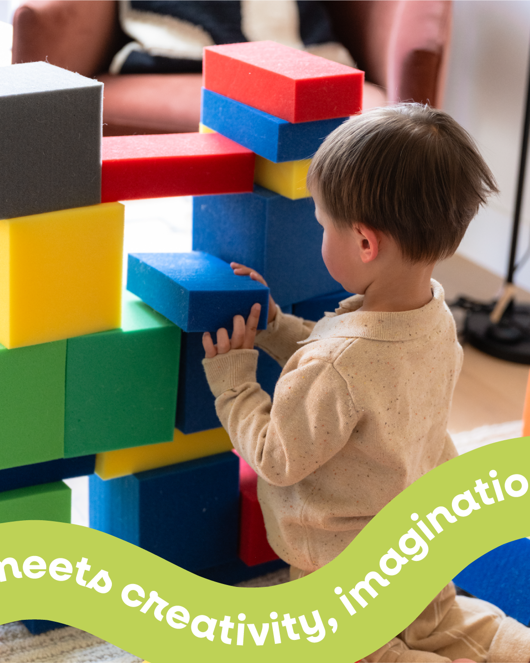
Packaging to screen
The same whimsical, color-forward identity from the physical packaging carries directly into the type, layouts, and color choices on screen.
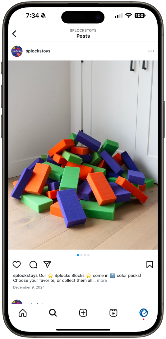
Photography as a trust signal
Launching a D2C brand with no reviews, no press, and no word-of-mouth means trust has to be built through the design itself. I photographed all product and lifestyle images, giving the brand a consistent, high-quality visual identity that felt credible and warm. When a shopper lands on a product page for the first time, photography is often what converts hesitation into confidence, investing in that from day one was non-negotiable.